
GLG410 Electron Density 3D example
Introduction
As an example of Matlab's data analysis capability, I emailed Dr Robert T.
Downs of the University of Arizona's Geosciences Department at the
recommendation of Dr. Sharp.
Professor Down's research focuses on crystal structure and bonds. Look at
this animated gif of the NaSiOSi system:
http://www.geo.arizona.edu/xtal/movies/NaSiOSi.html
I had asked:
I am looking for a dataset of x,y,parameter that
the students might operate on a bit as well as visualize with the various
contouring algorithms I expect them to learn this week.  Do you have a
convenient and simple dataset I might use to broaden our horizons?
Bob replied with this:
Here is a dataset that shows a Na atom attached to the bridging O of a
O-Si-O-SI-O linkage. The DSAA is a command that I need to import the file
into surfer. The next line, 140 140, is the grid in both x and y, so there
are 140x140 data points. The x and y are not given, only the z. The next two
lines, -4.75 4.75 is the coordinates in x and y. the next line, .001158 807.
... at eh min and max values of z.
Good luck.
I needed the good luck because I was trying to understand what the matrix
scenario would be for Matlab. Here is what the original data file looks
like.
I had one more question:
so the following 4 columns of data are the z values?  If so, does it go
down the first column and then to the second and so on, or is it in rows?
I get the x and y description.  What are the units of z?
With this answer:
The first 140 data points are the first row, etc.
The units are electrons/angstrom**3
Matlab data analysis
Looking at the data
First, I needed to take that funny shaped
initial file, cut off the header, and transfer it to darkwing.
Here is some Matlab from a diary file:
>> pwd

ans =

/export/home2/ramon/glg410matlab/Na

>> ls

ans =

Na24.grd
Na24noH.grd
na
nalog
naorg


>> load na
>> load naorg
>> na_sort = sort(na);

>> plot(na_sort);
>> title('Electron density sorted')
>> xlabel('Observation#')
>> ylabel('Electrons/angstrom^3')
Here was the resulting plot:

So I concluded that most of the data were pretty small numbers and I better
be careful if I tried to contour the data because I might only see the
peaks.
Contouring
In order to contour, I needed to reshape the original file of electron
densities into a matrix that had the same shape as that with which the
observations were made:
>> size(naorg)

ans =

        4900           4
>> naorg_sq = reshape(naorg',140,140);
>> size(naorg_sq)

ans =

   140   140
Luckily, that command reshape made it easy. Note how I did it on
the transposed (') version of the matrix. That was because reshape works
column-wise and Bob gave me the data wrapped into rows.
Then I built the x and y vectors based upon what Bob said the distances of
the observation space were:
>> xstep = (4.75- -4.75)/139

xstep =

    0.0683

>> x = [-4.75:xstep:4.75];
>> length(x)

ans =

   140

>> y = x;
And then I made the contour plot:
>> contour(x,y,naorg_sq);
>> title('A few equal spaced contours')
>> xlabel('distance, angstroms')
>> ylabel('distance, angstroms')
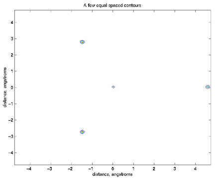
But you can see that I was depressed and thought maybe I made an error
because there were so few contours. As I thought about it, I figured that
the contours were being dominated by those few very high density
observations. So, I noted that you can give the contour command a vector
(in this case v)
of specific contours to plot:
>> v=[0:0.01:0.5];
>> contour(x,y,naorg_sq, v);
>> title('50 lower contours')
>> xlabel('distance, angstroms')
>> ylabel('distance, angstroms')
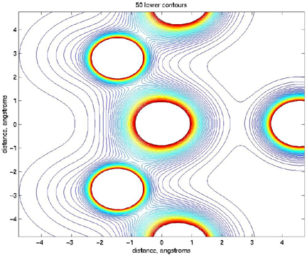
So that looks a bit more like the picture that Bob sent me.
Surface plots
Time to get fancy. I figured I would try to have a look at the real 3D
viewing action:
>> surfl(x,y,naorg_sq)
>> shading interp
>> title('Surface plot of electron density')
>> xlabel('distance, angstroms'),ylabel('distance,angstroms'),zlabel('electrons/angstrom^3')
>> colormap pink
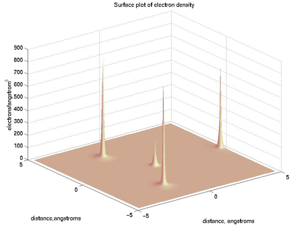
Pretty cool, eh?
Clipping the data
I was not so satisfied, because obviously Bob is interested in the
electron density distribution in the neighborhood, and maybe figures that
the peak values are biased by actually from where the measurement was
taken.
We need a way to cut off those peaks.
Luckily for us, we can use MatLab's relational operators.
| Relational operator | Description |
|---|
| < | less than |
| <= | less than or equal to |
| > | greater than |
| >= | greater than or equal to |
| == | equal to |
| ~= | not equal to |
So let's see how they work:
>> a = 1:9, b = 9-a

a =

     1     2     3     4     5     6     7     8     9


b =

     8     7     6     5     4     3     2     1     0

>> tf = a>4

tf =

     0     0     0     0     1     1     1     1     1

finds elements lf a that are greater than 4.  zeros appear in the result
where a <= 4 and ones appear where a>4.

>> tf = (a==b)

tf =

     0     0     0     0     0     0     0     0     0
finds elements of a that are equal to b.
So here is how I did it for the electron density:
>> tf = naorg_sq<0.5;
>> surf(tf)
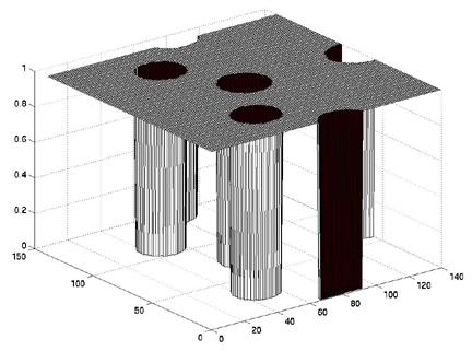
You can see that the cylinders of 0 values are where the electron
densities are greater than 0.5.
>> clip = tf.*naorg_sq;
that is the crucial step. We do a dot product (element-wise
multiplication)
of the two matrices and make all the electron densities that were > 0.5 =
0. But we don't want our contours or surface plot to have a bunch of holes
in them, so let's keep going.
>> tf = tf-1;
>> tf = tf.*-0.5;
So there we take the tf matrix and lower everything by 1, so now the
places where the electron densities were too high have values of -1 and
everything else is 0. Then we multiply by -0.5, so the places with
electron densities too high end up being equal to 0.5 and all else is 0.
Now add the new matrix to the one we clipped moment ago and plot:
>> clip_n_clean = clip+tf;
>> surfl(x,y,clip_n_clean)
>> shading interp
>> colormap pink
>> view(285,45)
>> title('Surface plot of electron density < 0.5 e^-/ang^3')
>> xlabel('distance,angstroms'),ylabel('distance,angstroms'),zlabel('electrons/angstrom^3')
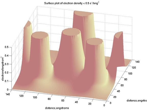
In that plot, you can see I used a surface plot with lighting, changed the
shading to interpolated (works best with surfl), used the pink
colormap, and changed the view position.
Here all of the plots put together onto a single figure using the subplot
command.
Here is the Matlab diary for the whole thing.
What about the difference between two different datasets?
A few days later, Bob asked me:
I would be curious what the plot of the difference between the 2 electron
density maps looked like.
Here is my analysis
Laplace of Electron Density
Here is my analysis.
Pages maintained by
Prof. Ramón Arrowsmith
Last modified November 18, 1999